🔮 CleverFi : Web App Redesign
Client Project | Case Study

Our team worked with a client, Austin, TX-based startup CleverFi, to deliver a redesign of their mobile web app. We conducted user research, updated the look and feel of the app, and delivered a clickable prototype for the development team to implement.
Role
UX Designer
Duration
3 Weeks
Tool
Figma
Team
1 UX Researcher
3 UX Designers
Overview

What is CleverFi?
CleverFi is a technology that provides users with a personal network name and password that they can use to access Wi-Fi at any CleverFi location.
What was the ask?
The CleverFi team came to us with their brilliant technology that answers the question, “What if you never had to ask for the Wi-Fi password again?” But with not enough public information about the service and a less-than-intuitive web app, they were not able to build trust with their potential customer base.
The ask was to redesign CleverFi's web app into a product that users feel is trustworthy and easy to use.
What did we do?
We created an experience for users that is intuitive, sleek, and emphasizes transparency and communication so that a line of trust can be established between business and user.
Problem
Users are confused, skeptical.
CleverFi needs to better educate their users about their service and create trust with them.
Scope & Constraints
With only three weeks to build the app, which user do we prioritize?
This web app ideally has two sides: the Host View– for rental home hosts and business owners– and the Customer View– for users. The CleverFi team had us focus on the Customer View experience for this project. Another constraint is that this web app has no current users, so all research had to be conducted on the prospective user base.
User Research
3 research methods to gather data
1 / Questionnaire
A 14-question survey about Wi-Fi access while traveling, with 3 demographic questions and a screening question asking if the user had stayed at a rental home in the last three years. We received 35 responses from 11 countries.
2 / User Interviews
5 interviews from users who work remotely and enjoy traveling while working.
3 / Usability Tests
3 usability tests on the current CleverFi web app. The users were tasked with changing their personal CleverFi network name and password.
Questionnaire Insights
User Pain Points with Wi-Fi While Traveling
User Interview Insights
1. They want to be prepared
If users are working remotely and traveling, they will do research to make sure they can access Wi-Fi at the time and location they need.
2. Rental home connection is hit or miss
Users who stay at rental homes know they will have access to Wi-Fi. However, the connection is not always reliable.
3. They are skeptical
Users are aware that not all wireless internet is safe and secure.
4. Lack of Wi-Fi can be stressful
When users expect to connect to Wi-Fi but cannot access it, this causes stress.
Current App Usability Test Insights
These are screenshots of the current web app offered by CleverFi.
In the current state of the app, users log in with their phone number and receive a code via SMS to get into the app, where they then have access to their personal CleverFi network name and password. They can go into settings and change these. The app is not very extensive, but it doesn't need to be.

Missed connection
Users did not understand that logging into the app does not connect them to a network.
What's in it for me?
Users need more details about the benefits of CleverFi before using it.
It's a trap!
Users were not confident that this was a safe and secure method of accessing Wi-Fi
I can't get no...
Users rated their satisfaction with the web app a 2.5/5.
Persona

Alex, the Working Traveler
A tool to help us ideate the typical user.
This is Alex. They work remotely. Because of this, they get to travel domestically a few times a month and internationally a few times a year.
Their pain points are unsecured wireless networks and connectivity issues while staying at rental homes.
They need to know the Wi-Fi they're using is secure and reliable. They also need clear instructions on how to access Wi-Fi while traveling.
Alex needs a reliable way to ensure easily accessible, secure, and high-speed Wi-Fi while staying at their rental home.
Design Challenge ✨
How might we quickly educate the user about CleverFi so we can minimize confusion surrounding the service and provide a frictionless experience?
User Tasks
The most important user flows to be built within the web app.
Sketches
A collaborative effort to plan out the six main screens.
These are some early sketches of some of the main screens. We knew we wanted to have a welcome screen, a login, an onboarding, a home page, a settings page, and an About/FAQ page.
This web app is not very extensive because the user wouldn't really be using it all that often, due to the "seamless connection" aspect of CleverFi. What mattered here is that we had to make a good first impression, so these few screens needed to do a lot of heavy lifting. Since these sketches, we iterated over and over.
Wireframes
Using design principles to map out a usable, aesthetically pleasant product
This is where we implemented our knowledge of design principles to lay the groundwork for our first prototype.
🍔 We implemented a hamburger menu. The homepage was too cluttered without one, and our goal was to make using CleverFi simple and intuitive.
📸 We included a video from the CEO in "About" page. Whether or not users choose to watch it, the presence of a video from the founder shows that there is a face and a team behind this service, as users had previously expressed a lack of trust.
🍒 We added a profile page. This is where the user's personal information such as name, email address, and phone number would be stored.

Old Home Screen Layout
vs.
Lo-Fi Home Screen Layout

4 Big Changes
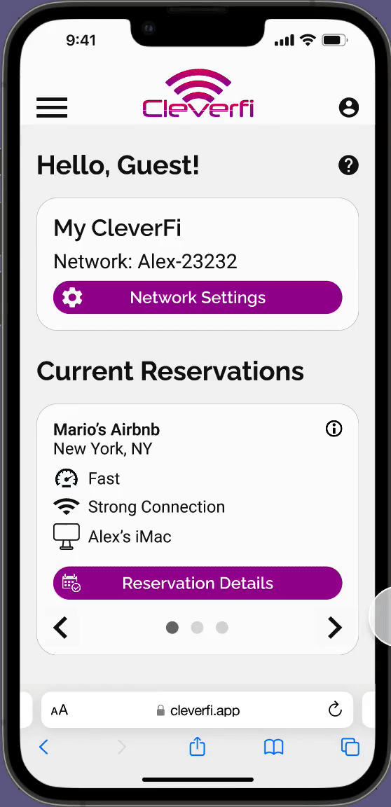
We changed the "Home" and "My Guest Home" labels to "My CleverFi" and "Active Reservations. This shows the difference between where users can access their network information vs. where they can access their CleverFi reservations.
We removed the ability to see your password on the home screen, providing a better sense of security.
We added a button to review CleverFi, in accordance with our user task.
We added speed and strength widgets to the screen for each of your active reservations so you can know the status of your connection.
Usability Test
#1

74% misclick rate on My CleverFi page
Users are satisfied, but there is room for improvement.
We ran a usability test on Maze.app with 16 participants, tasking the users with missions from our user goals: Changing their network name, finding the "About" section, and writing a review.
A main issue was that it wasn't clear to these users that they had to click "Edit Network" before being able to tap on and change the name. You can see the amount of error clicks in the image-- this screen had a misclick rate of 74%.
Users rated their satisfaction with our redesign overall a 3.9/5, with a mix of feedback. Read some of their quotes below.
Tester #100561092
"It's straightforward and easy to navigate."
Tester #100577428
"The layout is *stellar* and everything is totally straightforward. I’m not sure how to read the speedometer thing but that probably my own fault."
Tester #100569203
"Wi-Fi speed in the connection status section (what I'm imagining the gauge is) doesn't seem necessary."
Style Guide
Simple and sleek
The style of the app is mostly whites, with pops of color. We used the purple with white text for most buttons, as this contrast is appealing and accessible.
The gradient for the first two screens is inspired by our color palette, and is coupled with the off-white text for accessibility.
We picked Raleway and Roboto for our fonts. These are both readable sans-serif fonts with many styles.

Lo-Fi Home Screen Layout
vs.
Mid-Fi Home Screen Layout

Why were those icons so big anyway?
From the usability test feedback and the style guide, we designed a mid-fidelity version of the web app.
We removed the "online" indicator. Users found it to be redundant, as if your connections are listed below, it is implied you are online.
Users remarked that the speed and strength widgets were unnecessarily large, so we condensed the "Reservations" section.
Though this is one of the user tasks we had established, we removed the "Review CleverFi" button. it was adding clutter to the home page and would be best off accessed through the reservations tab: where users can review their experiences at specific CleverFi locations. This would provide more targeted feedback for the engineering team.
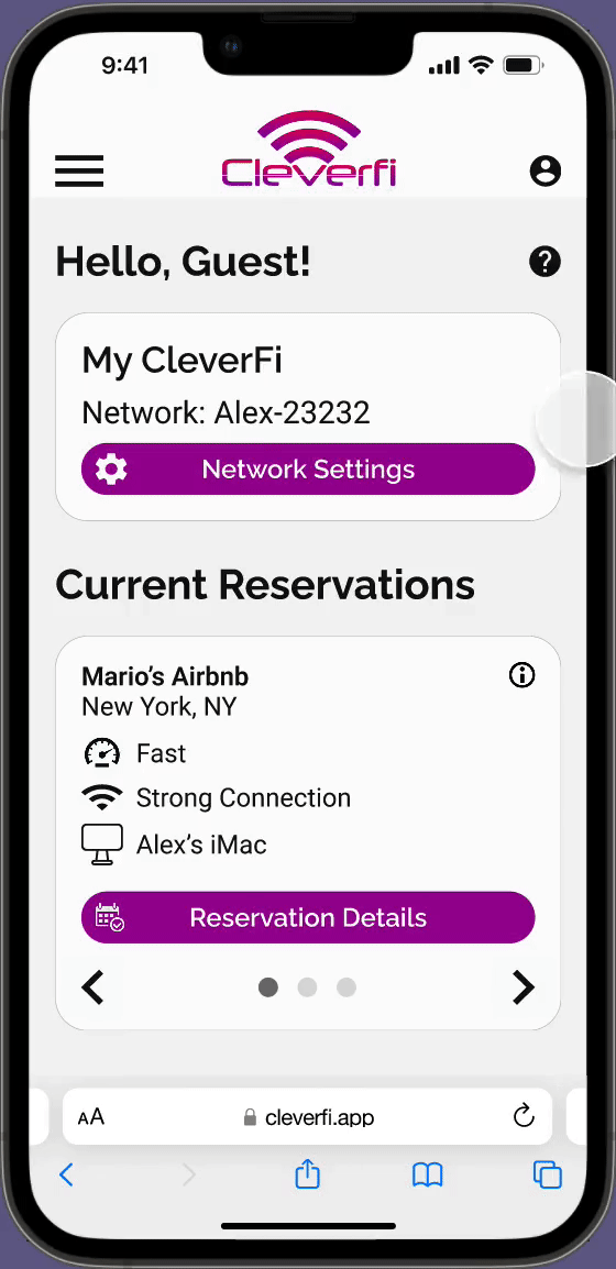
Mid-Fi Network Settings
Tap here, not there
To address the issue of usability test misclicks in the "Network Settings" section, we grayed out the text to show that it cannot be edited. The text becomes darker once the user clicks "Edit Network."

Usability Test #2
Satisfaction increases
Our second round of usability testing showed that we were heading in the right direction. We conducted monitored usability testing with three users, giving them the task of, once again, changing their network name. We gave them a time limit of two minutes from the initial welcome screen, and they completed it successfully, in an average of 45 seconds.
The main piece of feedback we got from these tests was that the speed and strength widgets would probably not make sense to most people. Sure, some understand what a good mb/s is, but to make it accessible to most, all three users recommended we change or remove it.
Their satisfaction in total averaged a 4.2/5. See how that compares to the first two tests below.
Satisfaction Scores
from Usability Tests
Hi-Fi Login and Onboarding
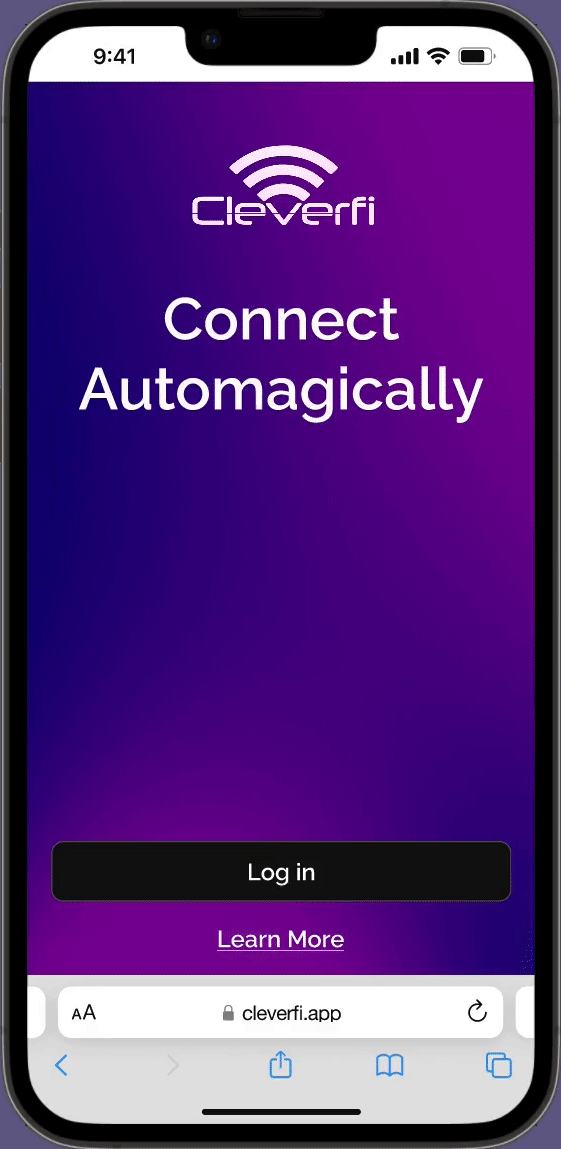
A welcoming feel
Here are the hi-fidelity welcome and login screens. The user receives their access code via SMS or email and enter the web app. They also have an opportunity to learn more about CleverFi before even signing in-- that "Learn More" link would lead to their website.
As for the onboarding, we wanted to make it aesthetically pleasing, quick, and informative. It doesn't give the nuts and bolts of everything, but there is just enough information presented in a trustworthy way that users feel more comfortable using the service.
Hi-Fi Home Page & Network Settings
Simplifying it
We took what users told us in the second round of usability testing about the speed widget applied it. Many people don't know what mb/s means, so we simplified the download speed feedback to "fast," "good," or "slow." Users also mentioned we should show which device is connected, so we added that information.
Hi-Fi FAQ & About Us
Two separate pages
In the hi-fi, we chose to make separate "FAQ" and "About Us" sections. FAQ is more about how CleverFi works and is there for user troubleshooting needs. About Us is more for users to see that this is a real company with passionate people behind it, not some mysterious scam stealing your data.
Next Steps
1 / Build out "Host View"
This prototype is what our persona might see. But there's another side to this service-- the business owners offering CleverFi in their rental homes, cafes, restaurants, etc. Our first step would be to do some research on this user base and work on building their side of the web app.
2 / Construct "Reservations" Section
Reservations are an important part of CleverFi-- they keep track of where you are currently connected, where you have been connected, and even where you plan to be connected. The current section is very unfinished, so we would ideally like to reorganize it and make it a useful catalogue for CleverFi users.
3 / Design Profile Page
The profile page is where your personal information, such as name, phone number, and email are kept. In the current version of CleverFi, you cannot make an account as you would on most websites. Users just log in with their mobile or email each time. Eventually, if the technology allows for it, this profile page is where your account information would be as well-- such as a username, password, or social media linked to CleverFi.
Thank you!
This was a great experience overall. We had a lot of creative freedom, but had to adhere to some important guidelines from the company. We communicated throughout the project with the engineers, product owner, CEO, and developer, making sure that we were creating a project that was viable and up to their standards. And in the end, they were very pleased with our work. I'd like to thank Mario Soave and the CleverFi team for this opportunity.